Creating a smarter working world
Industry
Marketplace
What I did
Verbal Identity, UX Writing, Content Design, Information Architecture
01 - THE CHALLENGE
Create a series of intuitive in-app journeys for Worka that helps company employees find their perfect workspace; workplace providers sell and manage their workspace listings, and companies reduce unnecessary workplace costs.
02 - THE OPPORTUNITY
Focusing primarily on SMEs (vendors) and employees (end-users), Worka wanted to be a leader in the field of Marketplace with its flexible workspace solutions. The opportunity was there, but they needed an in-app experience that matched their vision. We needed to simplify their language, streamline their app UX, and inject personality into their brand.

03 - THE PROCESS
Focusing primarily on SMEs (vendors) and employees (end-users), Worka aims to be a leader in the field of Marketplace with its flexible workspace solutions. To kick the project off, I conducted a content audit of all the existing designs so I had a clear understanding of the platform ideation, and what we needed to achieve as an MVP;
Conduct a content audit across the entire product
Write and edit user-focused content across the Worka web app and Worka.com
Collaborate with designers, product managers and engineers in Figma and the dev environment
Act as a Worka voice and tone consultant, guiding non-writers where necessary
Develop the vocabulary and terminology throughout the product including documentation for the team
Work with legal and regulatory teams to make sure any content you write is compliant with industry standards and regulations, where necessary
Contribute to team documentation including content design guidelines
Use stakeholder feedback and testing takeaways to iterate effectively.
It was important to conduct a competitor analysis to evaluate: how other similar platforms tackled similar challenges we faced; what elements and features work well and could help us achieve our goals for the app and understand which elements have been implemented that we may have initially missed.


04 - THE SOLUTION
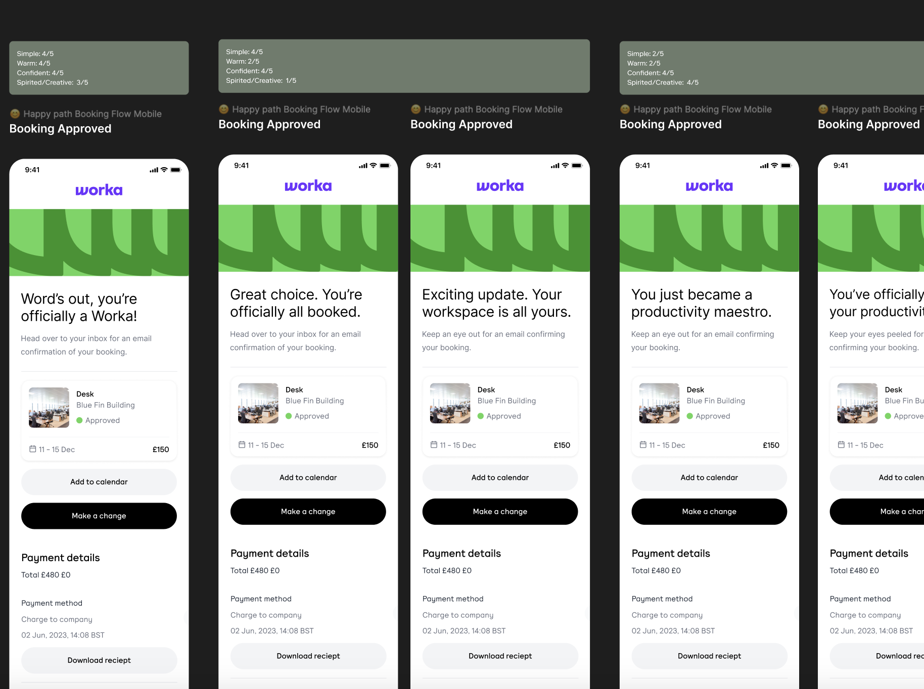
I started creating tonal dimensions to put forward to key stakeholders, with examples of how the tone might flex depending on the context and user need. Once a direction was chosen, I created a comprehensive resource that provides definitions and usage guidance for Worka terminology across all product categories. As our definitive source of truth, I encouraged the team to update it regularly.
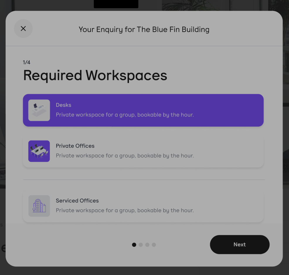
Several iterations of this process were completed by product designers until the interactions were fully mapped out and any useful user feedback implemented. I then used the wireframes to provide further context into the user journey for both the end users and vendors and continue to engage them throughout the product. This was achieved by implementing usability heuristics of user control and freedom:
The onboarding process guides the end user through creating their Worka profile using prompted, autocomplete fields.
The onboarding process for vendors guides them through the listing of their workplace, providing tooltips to help make their listings stand out and better attract employees looking for a space to work.
Once registration is completed, the web app then encourages the user to explore the marketplace for inspiration for their next workspace booking. If they’re a vendor, they’re prompted to look at other vendor listings and create a listing of their own; if they’re an employee Admin within a company, they are encouraged to create groups, invite group members, control budgets, and grant user permissions.


